Heads up: I’m a Flodesk Partner and this post is part of Flodesk’s paid partner content program. It also contains affiliate links, meaning if you sign up through them I get a small kickback, you pay the same. All opinions are my own and I only share tools I actually use.
I just wrapped a rebrand for one of my clients and needed to send the announcement email to my own list. Around the same time, Flodesk gave me early access to their new email design app, Flodesk Studio, and asked if I wanted to test it on a real project. So this is what you’re getting: not a demo email I built to play with the tool, but the actual announcement that went out, designed inside Studio start to finish, with all my reactions, edits, and honest takes along the way.
Quick note on where I sit with AI before we get into it. I use it the way I’d use a good intern. For the parts of the work that aren’t the work, visual exploration, a first pass, something to react to when I don’t want to stare at a blank canvas. I do not let it write for me, strategize for me, or decide what my brand sounds like.
What got me curious about Flodesk Studio specifically is how Flodesk positioned it: built by real human designers, accelerated by AI, finished by you. Not a copilot, not an assistant doing the work for you, a place to work with a designer-built foundation underneath. That framing matched how I already use AI in my practice, so I said yes to testing it.
Let’s get into it 👇🏼
First, what is Flodesk Studio?
Quick context if you haven’t heard of it yet.
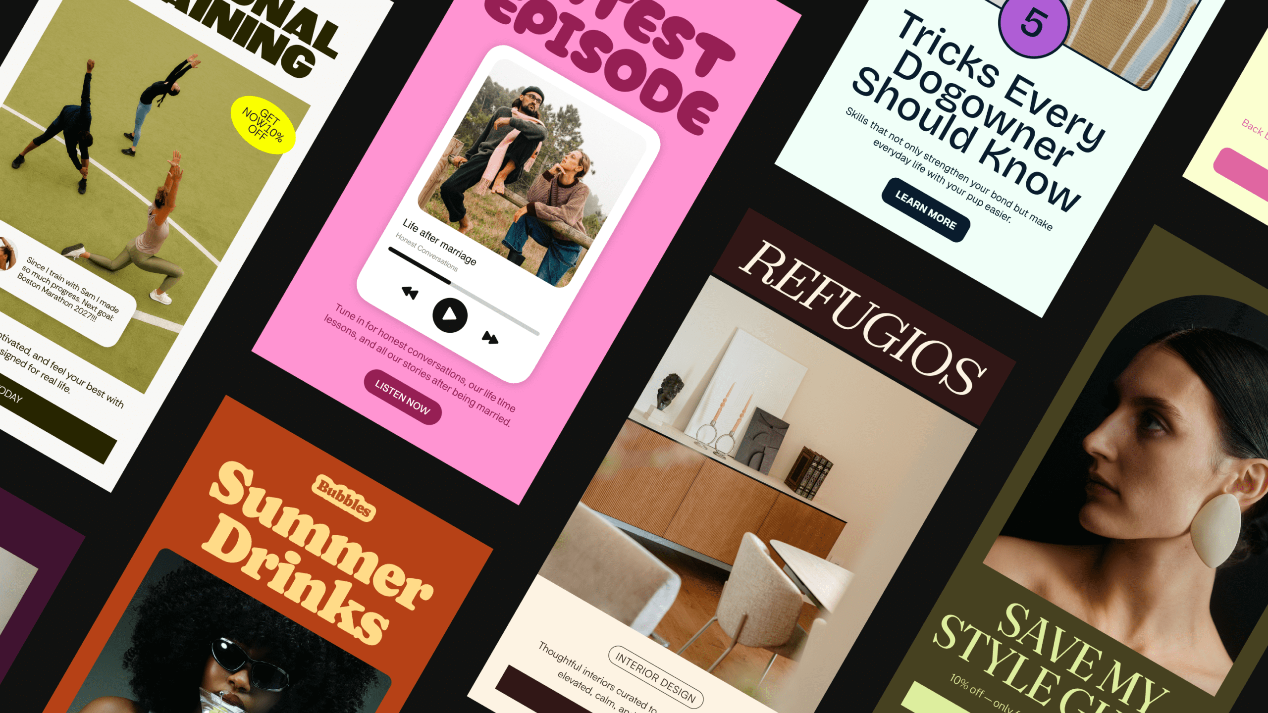
Flodesk Studio is a brand new email design app from Flodesk. You describe the email you want, it generates a designed version on-brand in seconds, and then you refine it from there (in chat or by hand, pixel by pixel). It’s built on a foundation of layouts, blocks, typography, and components hand-crafted by Flodesk’s in-house design team, which the AI assembles based on your prompt and your brand inputs. So you’re not getting AI-generated slop, you’re getting designer-built pieces arranged for you.
A few things worth knowing upfront:
- It’s free while in beta. No credit card, no upgrade required.
- It’s a separate app from regular Flodesk. You sign in at studio.flodesk.com with your existing Flodesk login.
- You can use it even if you’re not on Flodesk. Flodesk Studio exports your design as HTML to any email platform that supports it (Kit, beehiiv, Mailchimp, and others). Design here, send anywhere.
- The AI is not trained on your data or your subscribers. It’s trained on the design team’s work.
Okay, with that out of the way, let’s get into how I actually used it.
1. Set up your brand before you prompt anything [do not skip]
If you skip this step you’re going to get generic output and then blame the tool, so don’t 👩🏽💻
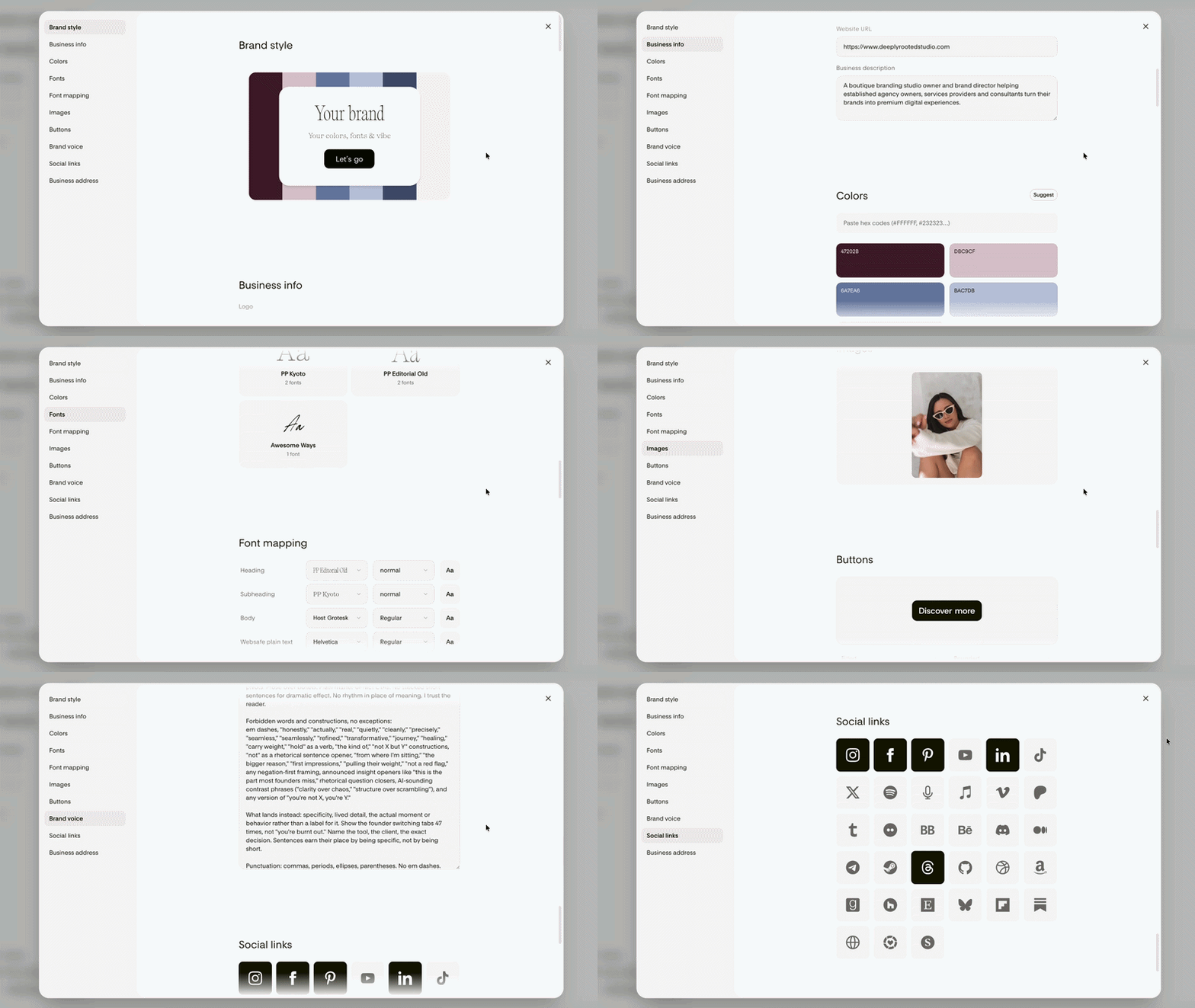
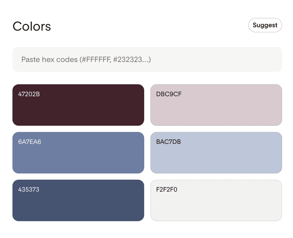
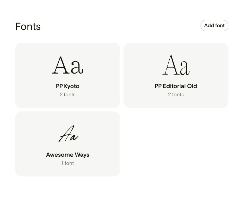
Inside Flodesk Studio you can upload your colors, your fonts (custom fonts work, which I really appreciated), and you can assign headings, subheadings, paragraph styles, AND fallback fonts. I don’t think the general public knows this but fallback fonts are really important – a lot of platforms don’t support custom fonts so this gives you some better options to work with.
I also pasted in my voice guidelines: what to avoid, how I sound, what I never want to see. I want to be clear though — I did this not because I was planning to let Flodesk Studio write the email, but because the more the tool understands about how I write, the better it can match the feel of the layout to the words I’m putting in.
Flodesk Studio stores your brand information so once you’ve set it up, every email you create stays on-brand without having to re-upload anything. Also, the AI isn’t trained on your data or your subscriber list. It’s trained on Flodesk’s in-house design team’s work, which is the part that makes the output feel designed rather than just generated.
2. Write your email first, then bring it into Flodesk Studio
This is the part where I deviate from how most people will probably use this tool 😅 IDK, maybe?
I wrote the entire email manually before I touched Flodesk Studio. Then I went in and used Flodesk Studio to bring the vision to life visually, because (and this is the actual reason I was excited to try it) there are layouts inside Flodesk Studio that the regular Flodesk editor doesn’t give you, and I wanted to play.
This actually lines up with how Flodesk positions the tool. They’ve been clear that Flodesk Studio is a place to work, not an assistant doing the work for you. It’s not a copilot, it’s not a helper, it’s not meant to generate your brand voice or your strategy or your final email and hand it back to you done. It’s a workspace with a designer-built foundation underneath, where you bring your ideas and finish them yourself. That framing matched my workflow exactly, which is part of why I was interested in testing it in the first place.
So: copy in hand, layout exploration in Flodesk Studio.
3. Let’s start prompting
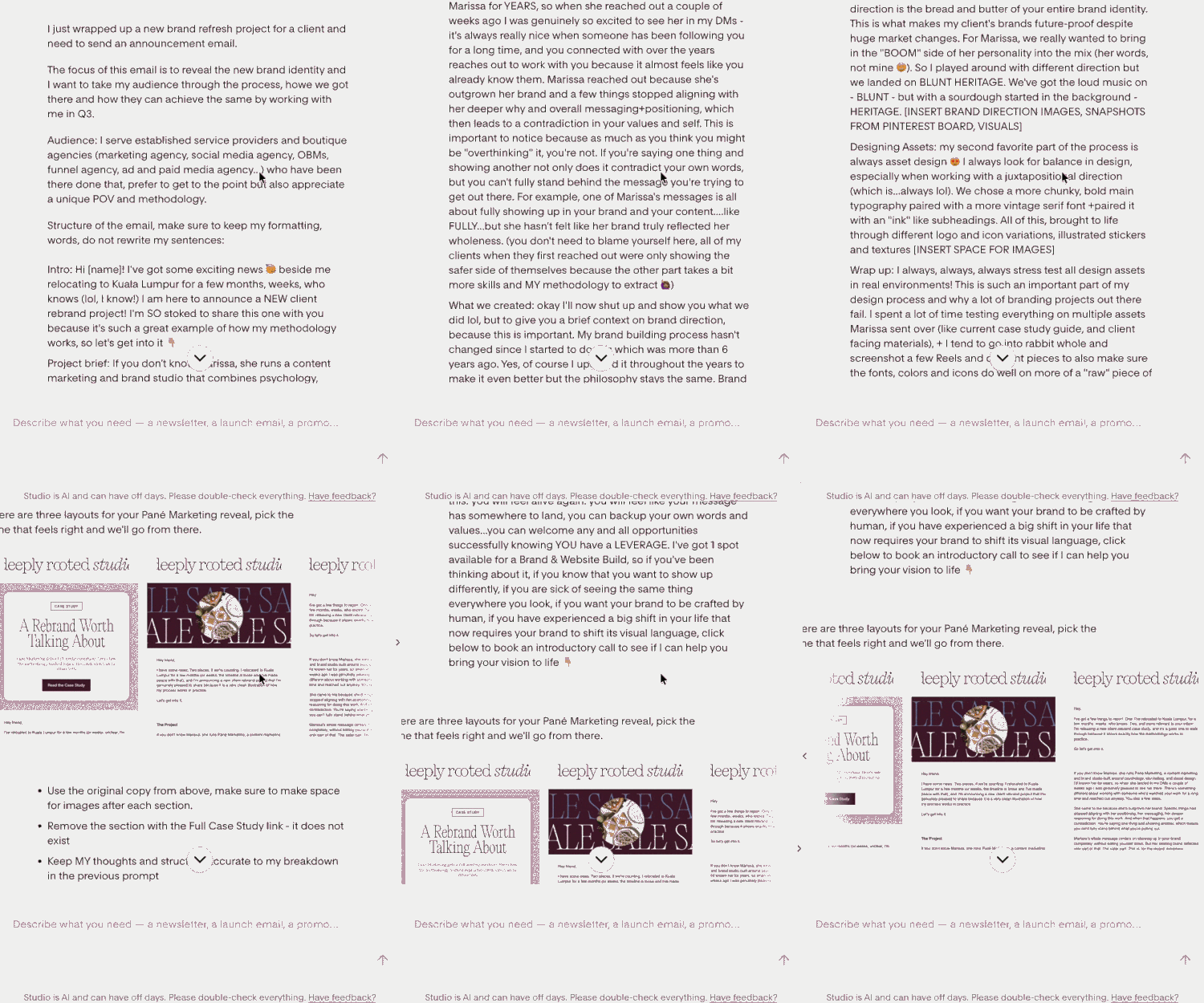
This is a really important step and I want you to take it seriously 🫡 The more information you give it, the better the output. I went with “more is better” and basically pasted my full email copy in along with notes on vibe, structure, and what I wanted visually. I’d rather over-prompt and refine down than under-prompt and get something generic 🥱
Here’s roughly what I gave it: who the email was for, what it was announcing, the structure I wanted (intro, project brief, what we created, design assets, wrap up, CTA), the visual direction of the client’s actual brand, and the vibe I wanted the email itself to evoke.
4. First design variation
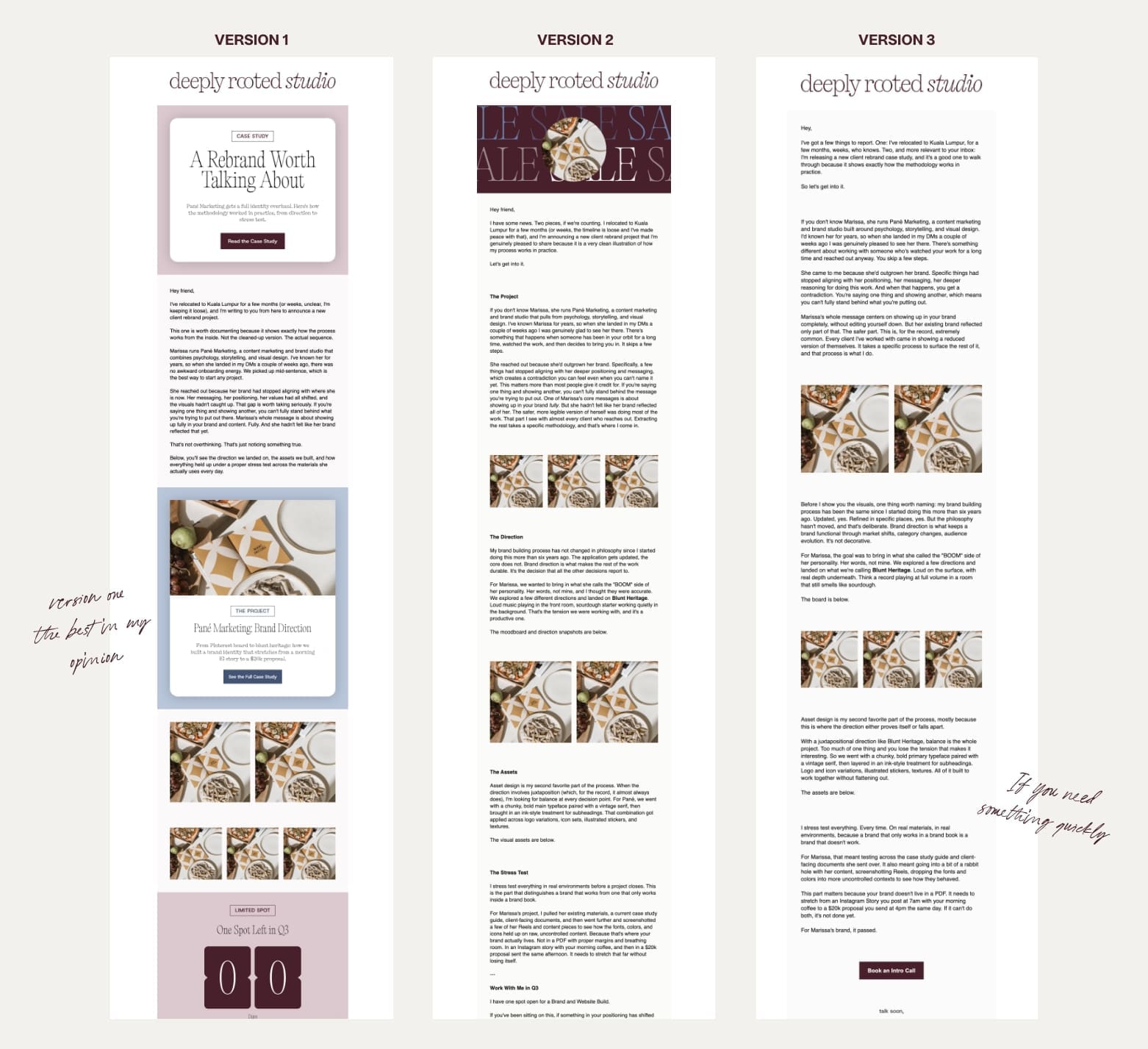
Flodesk Studio gives you three layouts to choose from: one more visual, one banner-style, one plain text. I appreciated that. You’re not picking from one rigid output, you’re choosing the direction that fits the email best.
Honest take: it did an OK job. I liked that I wasn’t starting from scratch (believe me or not, after spending 4 weeks starting from scratch on a client project, I needed something to just be okay) 😄
BUT.
Despite me literally writing in the prompt to NOT change my words, it changed my words. Which is the exact thing I’d warned you about, so let’s talk about how to handle that…but nobody is perfect so this isn’t something we can’t fix 😉
5. Follow-up prompts and the copy fight
I did a few follow-up prompts asking it to revert to my original copy. It mostly got there. I also asked it to draft a few more layout variations because I wanted to see what else it had, and I could already tell I was going to want to go in and adjust the headings, hierarchy, and copy myself regardless.
I picked the most design-forward of the three layouts because I was here to stretch the tool, and because this specific email had more to do than a standard newsletter (logo reveal, brand direction breakdown, asset showcase, CTA — a loooooot of moving parts).
If your email is simpler than mine, you probably don’t need to do this much. Pick the cleanest layout and move on with your life….it does a great job at quickly drafting everything you need in my opinion if you are a busy business owner juggling multiple things at once!
6. Going manual inside the editor
This is where Flodesk Studio actually surprised me.
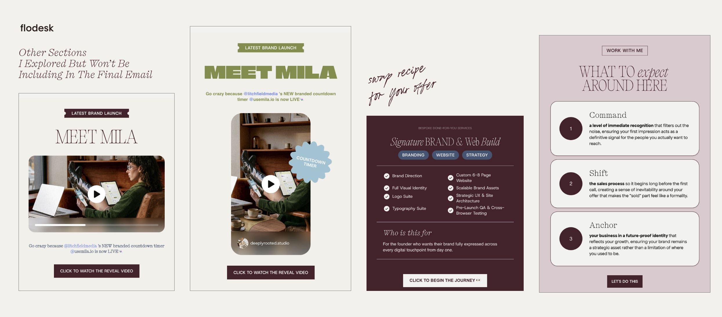
Once you go past the prompt stage and into the editor, there are sticker shapes, image shapes, section layouts, and block options I have not seen inside the standard Flodesk editor. The current Flodesk layouts can get repetitive, or you can’t always get them to do the thing you want them to do for presenting certain information. Flodesk Studio gives you a lot more room.
Things I liked:
- Way more creative freedom
- The stickers (I love a sticker), and you can move them freely and rotate them
- The shape options
- Layouts that are actually solid (not just one good one and ten filler ones)
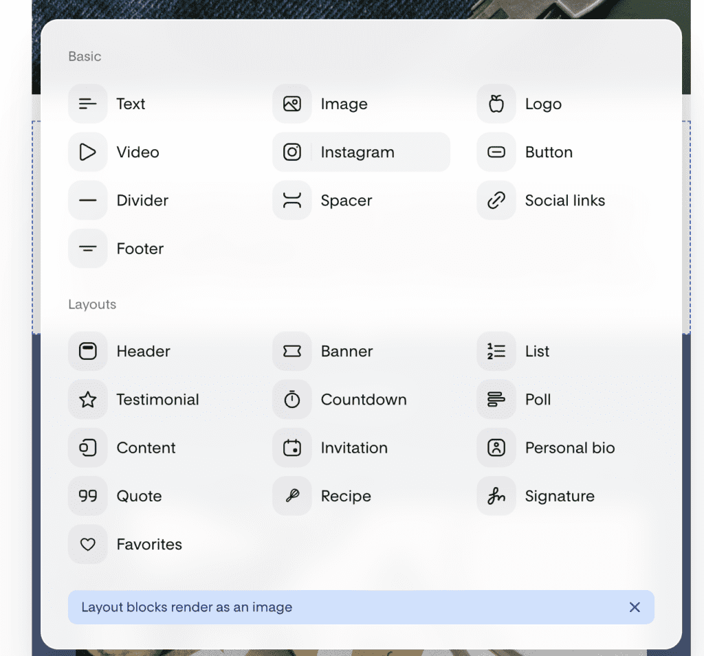
- The block library — headers, testimonials, countdowns, polls, quotes, recipes, signatures, plus block-card styles
One small flag: more options also means more decisions. If you’re someone who just needs to send something out quickly, this could feel overwhelming. If that’s you, don’t overthink it. Pick a clean layout, drop your copy in, send.
Layout Options
There are a few new options such a Recipe, Invitation, Banner, Personal Bio, List or Signature.
Each of the layout blocks include a variety of options, from simple ones to more “design-foward” ones if you’re using a lot of images.
Recipe Layout Idea
How I like to think about layouts when I am designing is choosing the “non logical” layout such as “Recipe” and instead of using that section for a recipe, I’d use it to breakdown my Done for you services 👩🏽💻 You’re welcome!
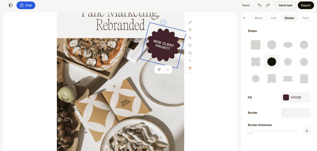
Stickers
You can not only change the shape of the stickers, you can also rotate them and move them freely inside the layout block! I am a sucker for a good sticker like icons in designs so this is much appreciated.
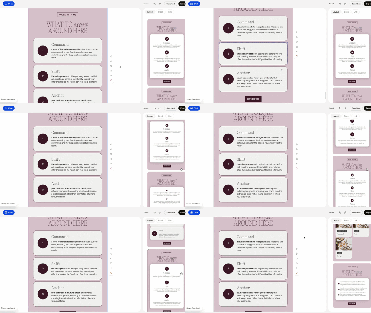
List Layouts
As I said, Flodesk Studio REALLY gives you so many options here! Emails can sometimes get really boring and difficult to skim through, so having a list layout is just a chefs kiss for me 🤌🏼
7. Who I think this works for
My honest opinion after using it: depending on what you’re sending and who you are, this tool fits some people better than others.
If you’re creative and love to visually express yourself but you’re not a designer by trade, Flodesk Studio gives you a lot to work with. You still need to bring real input though (your brand, your copy, a clear sense of what you want), so it’s not magic, it’s a much better starting point than a blank page.
I can see this being really nice for newsletters that need structure, or for delivering something more involved like a course or a challenge sequence over email. Anywhere you need clear hierarchy and a bit of visual punch, this tool will work for you.
One thing worth mentioning if you’re not on Flodesk: Flodesk Studio lets you export your design as HTML to any email platform that supports it (Kit, beehiiv, Mailchimp, etc.). So you can use it whether or not you’re a Flodesk user. Design here, send anywhere 😍
And to repeat the thing I said at the top: I would skip using it for your copy. Come prepared with your words, and let Flodesk Studio generate the layout. That’s where the value is.
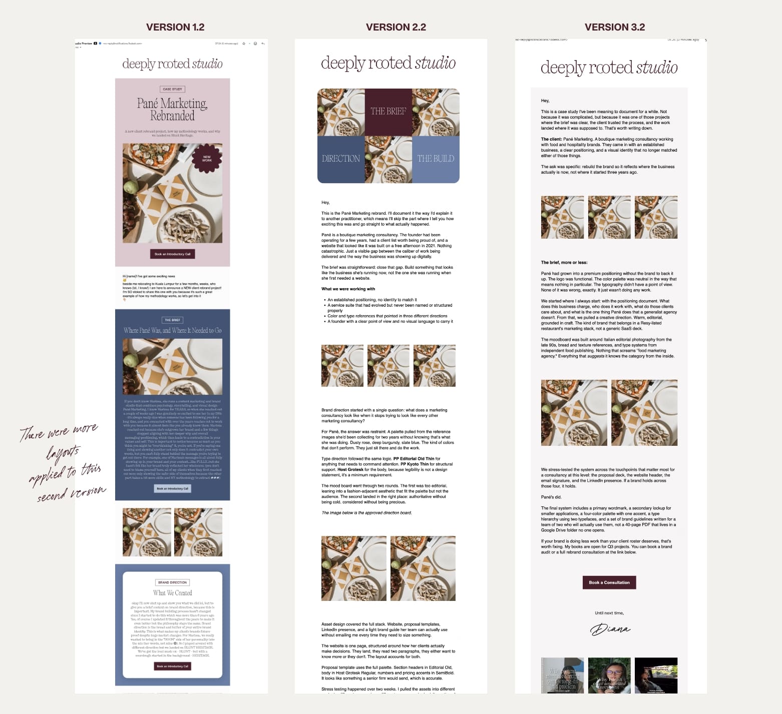
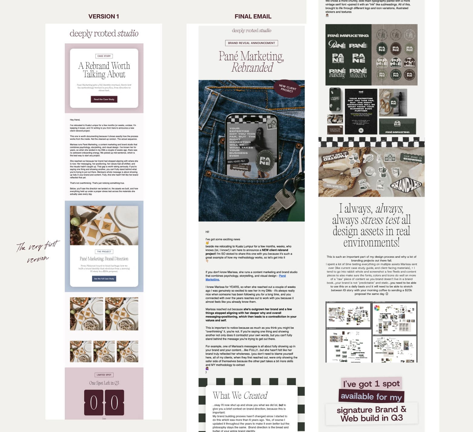
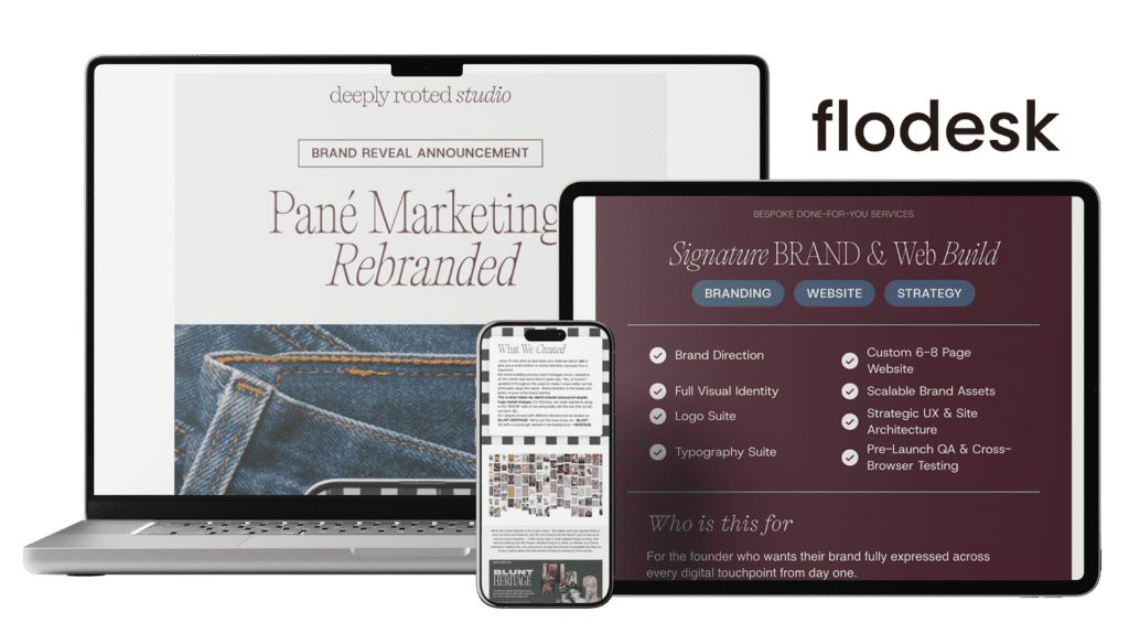
8. From first prompt to final design
Here’s where we started and here’s where we ended up.
Want to try it?
Flodesk Studio is free while in beta. No credit card, no upgrade required. Head to studio.flodesk.com to start.
If you end up loving it and want to send your emails through Flodesk too, here’s 25% off your first year through my partner link.
One last thing before I send you off…
Tools like Flodesk Studio work best when you bring a real brand into them. Colors, type, voice, a clear point of view. The output is only as strong as the foundation you’re plugging in, which is why my setup at the start of this post took as long as it did. If you don’t have that foundation yet, no design tool is going to invent it for you. That part still belongs to a human.
If you’re at the point where you know your current brand isn’t doing the work for you anymore, and you want a foundation strong enough to actually plug into tools like this and have them sing, that’s what I do. You can see how I work and get in touch here.


Be the first to comment